
Glade
Design System
Design System
We were tasked with modernizing every piece of Glade’s global communication, which led us to completely recreating their design system.
TVC
The creative team launched a series of VFX-led films, all designed to communicate to a multitude of cultures. And to spice it up, the team engaged in a bold music partnership with viral phenomenon Shawn Wasabi.

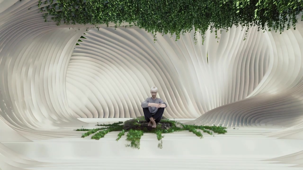

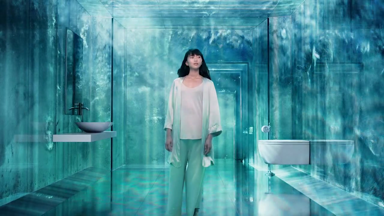
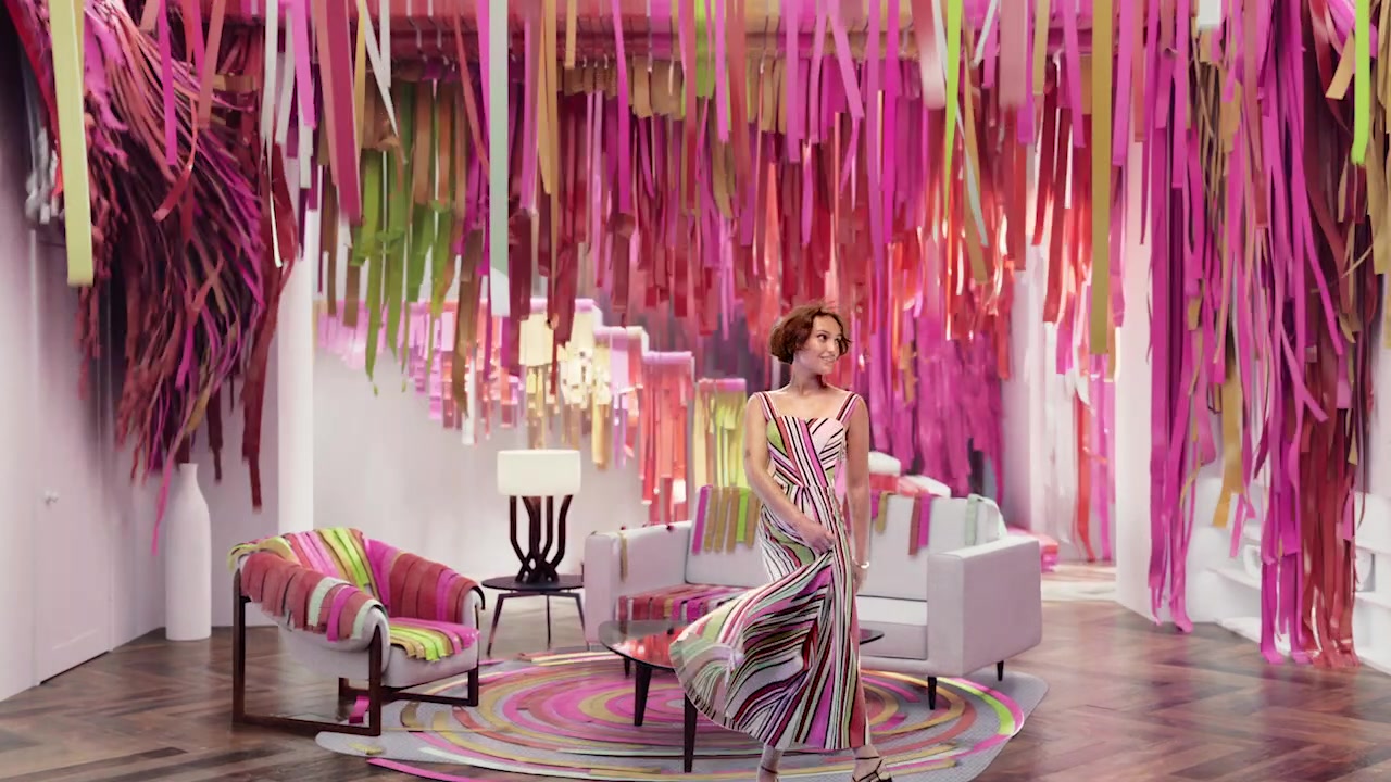
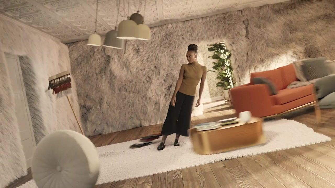

Fragrance Mnemonic
Through the use of immersive, photographic textures and color, we built a graphic language that showcases the complex blending of our cues in an elegantly simple expression.
A suite of dynamic fragrance mnemonic tags were created to cue the brand's consciously crafted fragrances in a bold way.
Fragrance Expressions
Every fragrance in the global portfolio was reframed through our graphic language to showcase the scents in an immersive, sensorial, ownable way.

Apple Cinnamon

Ocean Odyssey
Sea Salt & Gardenia

Lavender Vanilla

Blooming Peony & Cherry

Happy Space
Orange & Neroli

Moment of Zen
Lavender & Sandalwood

Lemon Fresh
Lemon & Mandarin

Relaxing Zen
Waterlily & Dewy Greens

Lavender & Peach Blossom

Morning Fresh
Green Apple & Muguet

Tropical Blossoms
Plumeria & Coconut Milk

Vanilla & Passionfruit

Tranquil Lavender & Aloe

Powder Fresh
Rose Petals & Baby Powder

Hawaiian Breeze
Pineapple & Hibiscus

Fragrance Cue Photography
To develop the fragrance expressions above, we needed a library of fragrance cues to source from. The imagery of our cues was key to evoking the senses, telling the fragrance story and recalling memories of the scents.
For a style that is undeniably Glade, we developed key principles for our immersive photography in regard to texture, lighting and color. From a completely remote shoot due to COVID, we captured over 200 images during 4 weeks of shooting.


Product Photography
Our fragrances are delivered through beautiful forms. The product photography captures function, innovation and design. With strong highlights, accentuating curves and form, we developed a library of appealing stills and dynamic shots.


Logo Reevaluation
In a highly competitive market, we drove brand distinction by rethinking our brand logo delivery.
Distinction
In a category filled with script typography, blue gradients and circles, we differentiated ourselves by emboldening our logo's presence.
Visual Anchor
The field of color gives the logo visual weight that pulls the eye's attention towards it.
Logo Attributes
The air-like attributes of the logotype are reinforced, moving and filling the four walls of the square field.


Color
Our fragrances are beautifully complex, so our color palettes should reflect that. We deconstructed each note to craft a palette that reflects our multifaceted fragrances. We also allowed the logo to take on the color of the fragrance story for each application.


Applications


OOH


Website


Social Content